
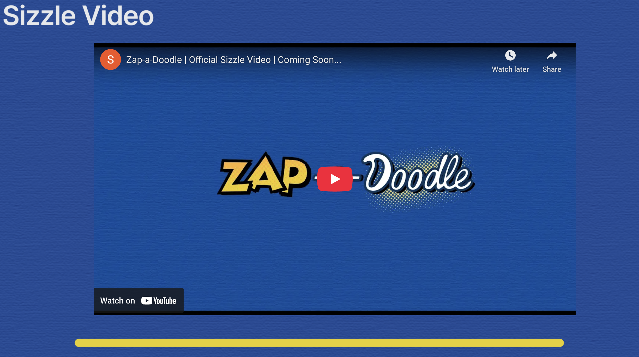

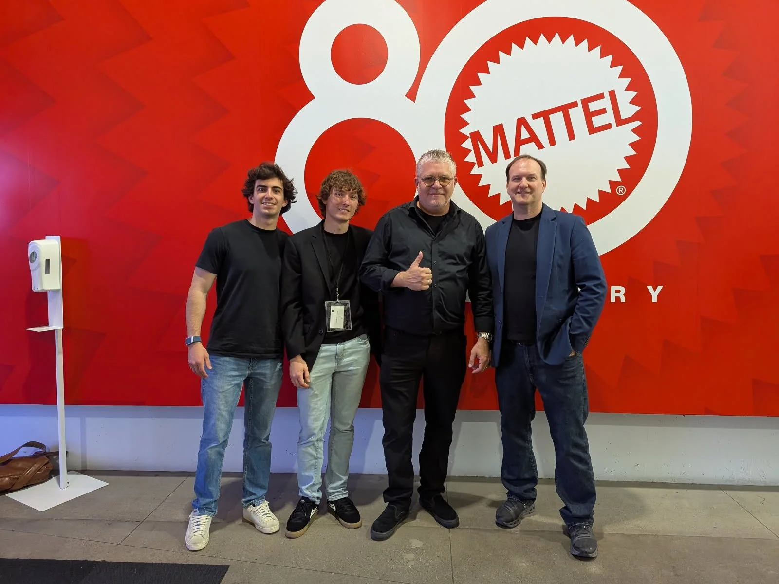
I am proud to share that my team from our IYA Designing Products for Licensing class at USC last spring had the incredible opportunity to ideate, design, fabricate, and pitch Zap-a-Doodle, the world’s first literal shocking game that uses a real shocking pen, to major toy companies, including Mattel, Inc., and Moose Toys!
This project was essentially a speed run, developed in under three months from first idea to final prototype. We began with three concepts. The first was a magnetic spatula that could stand upright and tilt when dirty to prevent messes. The second was a smart ring with two buttons designed to make presentations smoother without relying on a bulky remote. The third was a card game that combined a classic shocking pen, something we all loved and played with growing up, with a fast-paced drawing and guessing mechanic.

We ultimately chose the card game because of its novelty, its strong differentiation, and its clear licensing potential with the toy companies partnered with our class. What initially seemed like a simple idea quickly turned into a long and detailed journey of meticulous development.
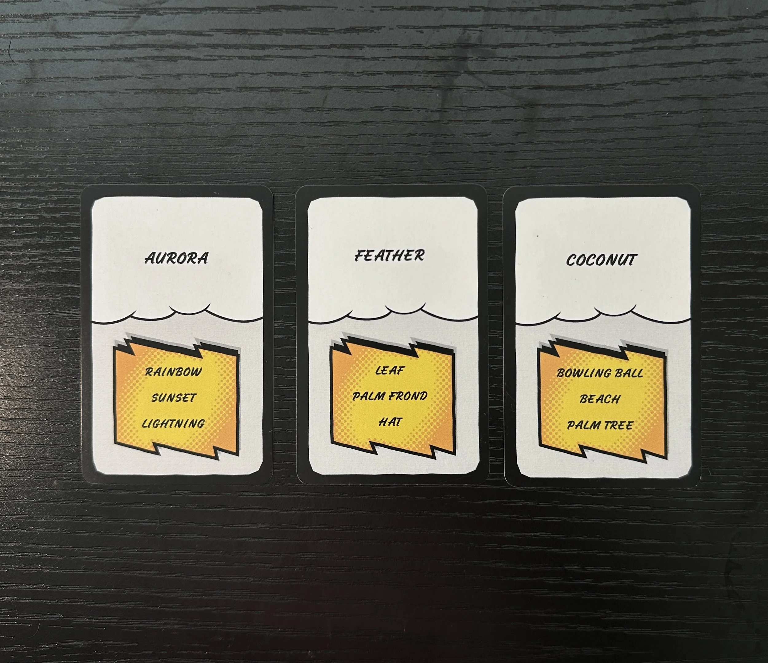
We began by drafting the game instructions as accurately as possible, which evolved significantly after multiple rounds of user testing. From there, we created two complete decks, totaling 104 cards. Every card was individually designed, illustrated, and tested for logic, difficulty, and gameplay balance, a process that required weeks of sketching and iteration.
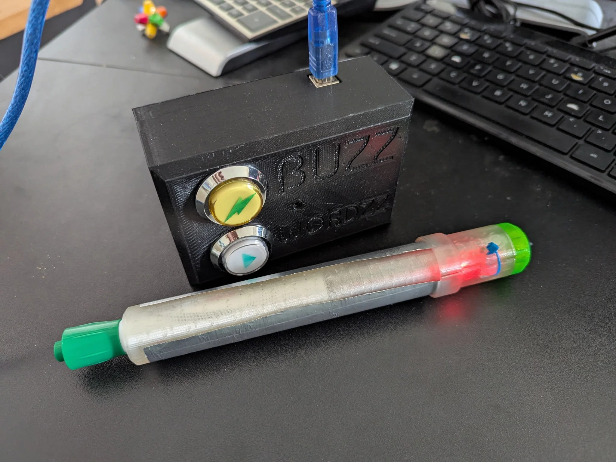
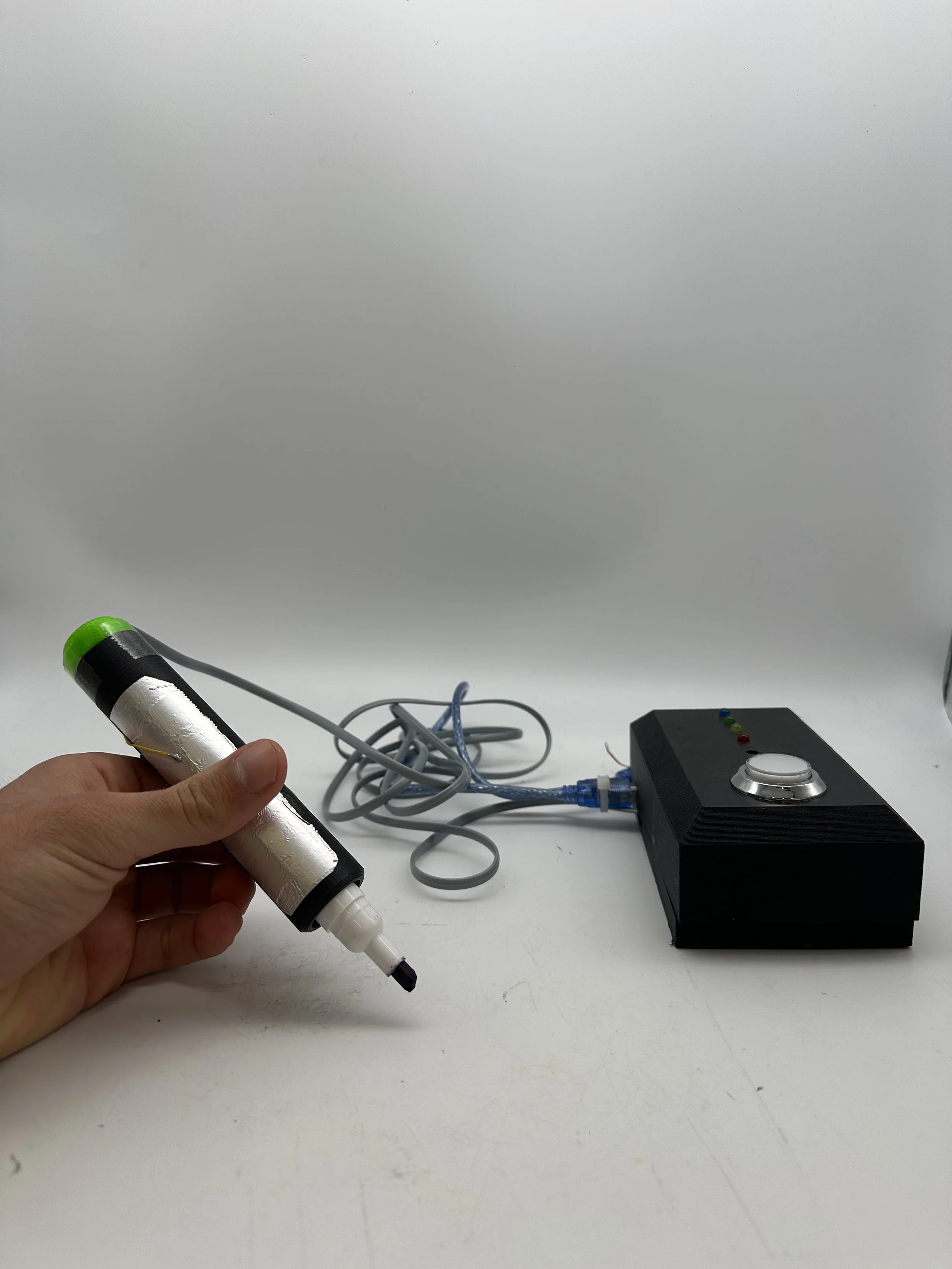
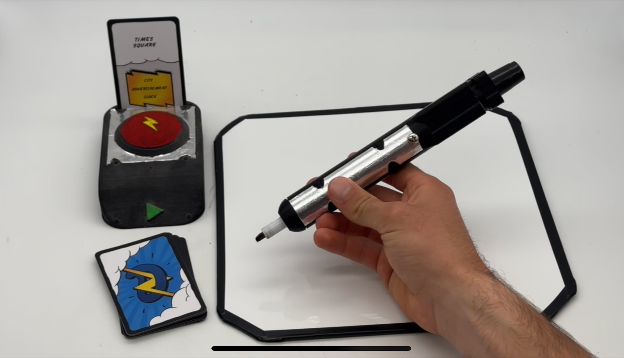
In parallel, we worked on developing the shocking pen and the zapper system. Julius, one of our team members and a master's student in electrical engineering, led the technical side with invaluable real-world experience. Together, we designed, modeled, 3D printed, assembled, and tested more than five prototypes, refining the components with each round.
Once the core mechanics were finalized, our focus shifted to bringing the game to life visually.


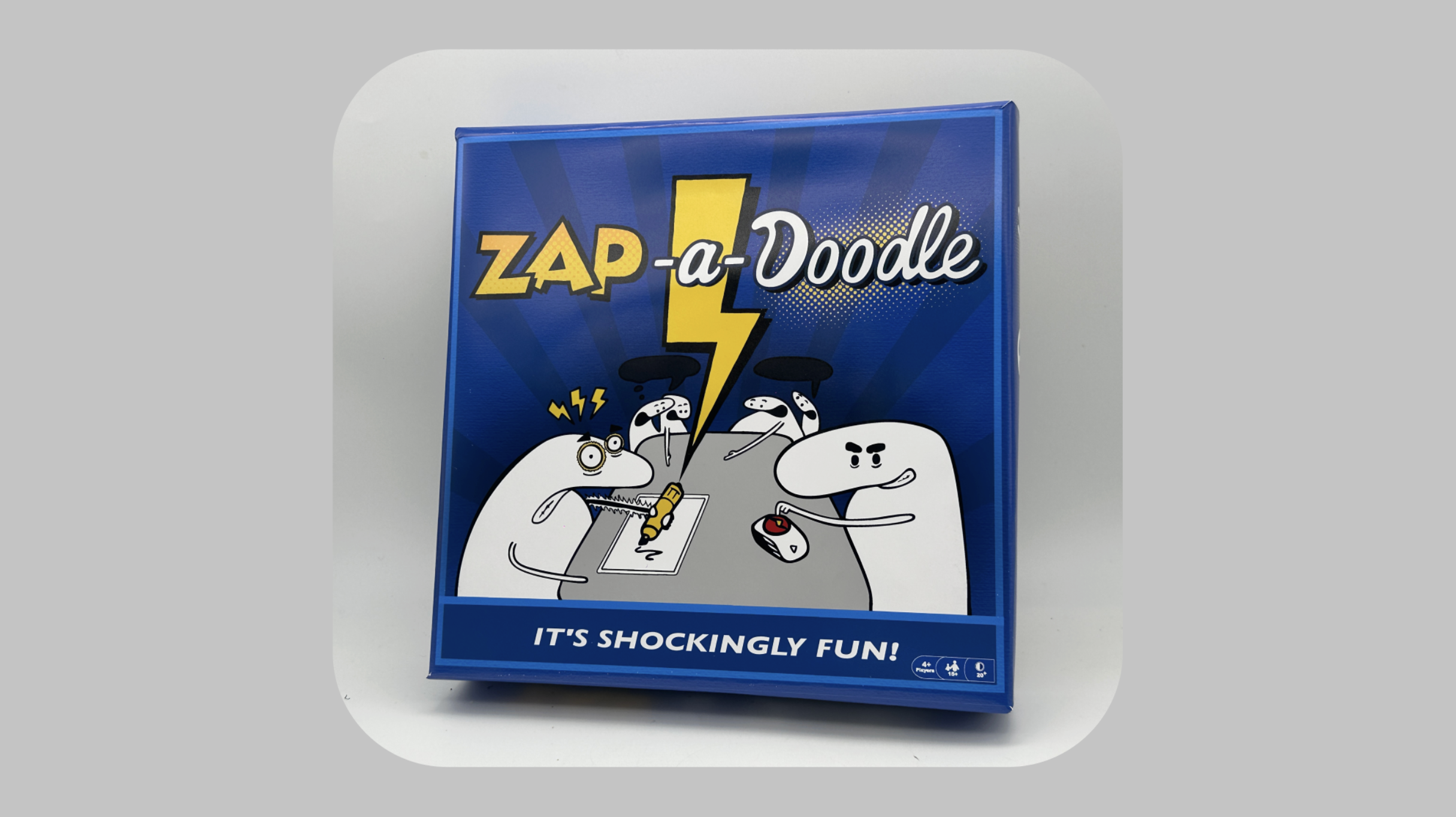
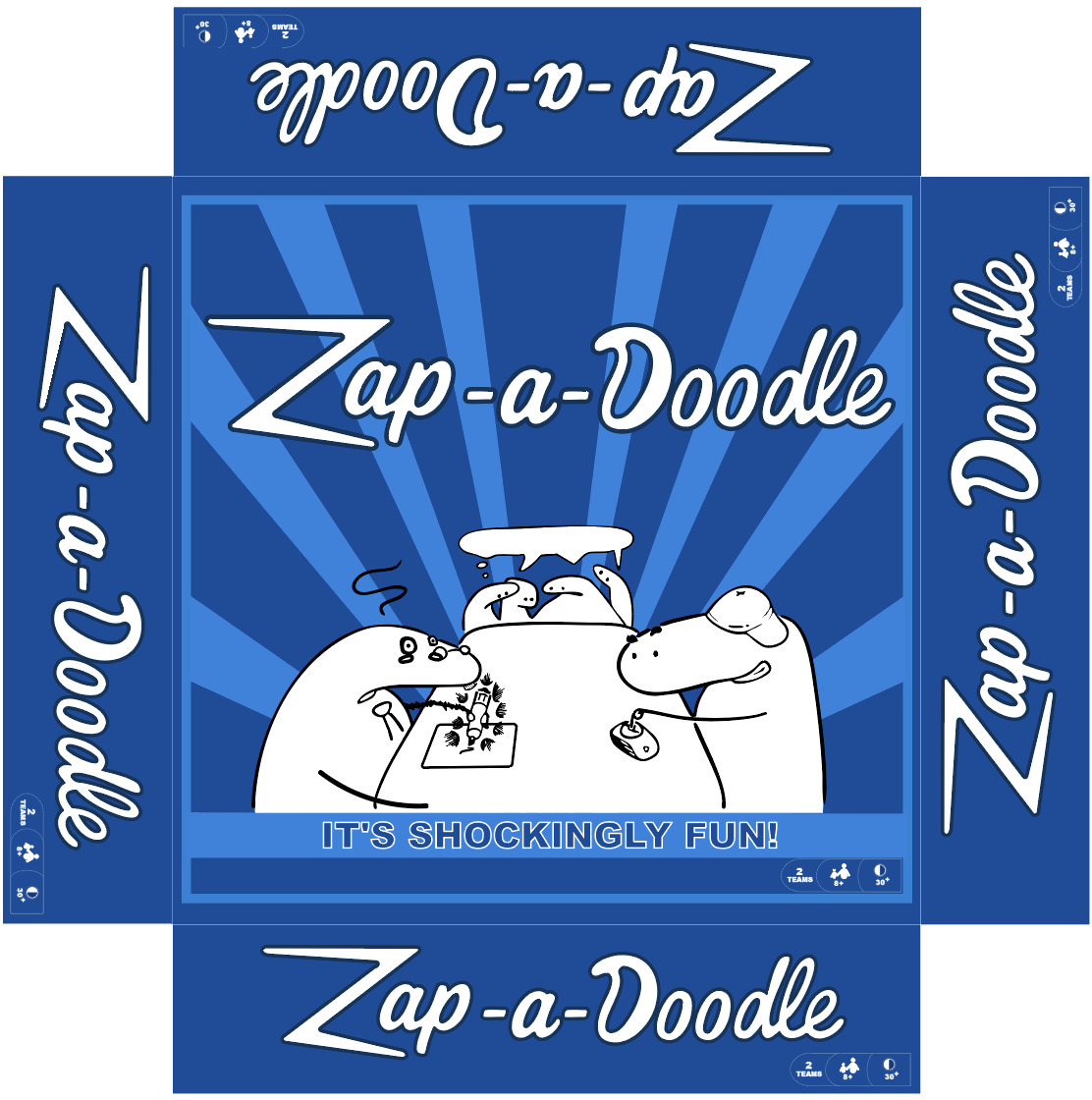
We created a cohesive theme, refined the aesthetic, and built a fully presentable product that could be confidently pitched to industry partners. In the early stages, we explored multiple directions, thinking carefully about how each theme would land with different audiences and how that perception could influence the product’s success. Our goal was to make the game fun and instantly relatable, while avoiding anything that felt too childish or overly mature.
We ultimately chose a visual concept that played directly into the spirit of the game: illustrated characters interacting with the drawings themselves. This helped reinforce the playful chaos of the experience while keeping the design clean and appealing. For the color palette, we leaned into the idea of shock and energy, using blue and yellow to echo the feeling of electricity without overwhelming the eye. The typography followed the same logic. The word “Zap” uses a sharper, more energetic font to convey the jolt of the game, while “a Doodle” uses a softer and more playful font to balance it with warmth and creativity.
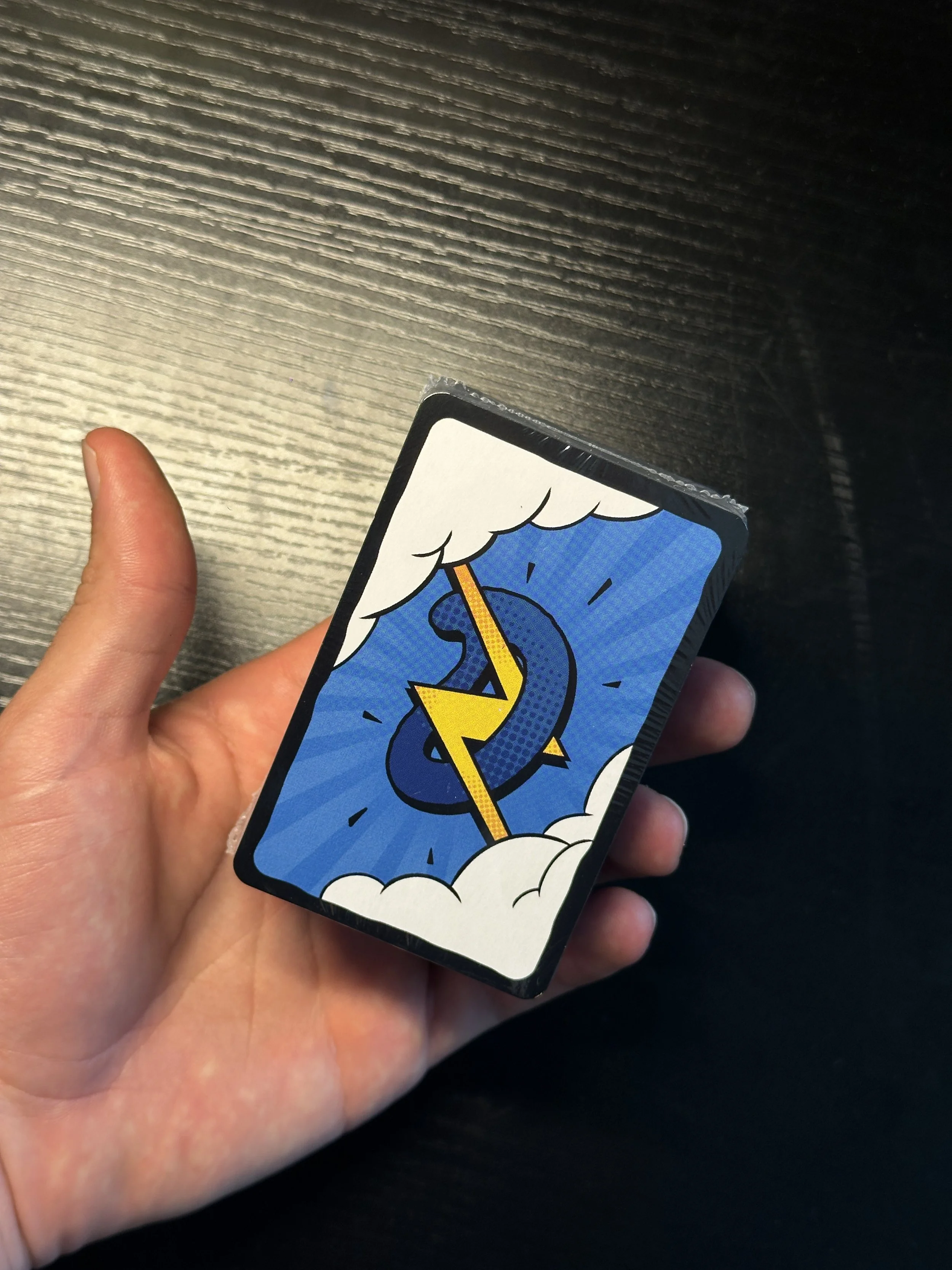
For the card design, we began by creating a logo that would appear on the back of every card. We chose to highlight the D from Doodle and integrated a lightning bolt through it to reinforce the theme of shock. From there, we explored different ways to present both the guess word and the zap word on the front of the card.
We ultimately landed on a cloud motif that plays visually on lightning. This not only framed the words in a fun and energetic way, but also tied directly into the overall aesthetic of the game. We carried the cloud and lightning elements onto the back of the card as well, creating a cohesive visual system.
To finish the design, we placed the zap words within a dynamic, electric environment that matched the lightning bolts and the energetic typography used on the box. The result is a unified card layout that feels playful, thematic, and instantly recognizable.


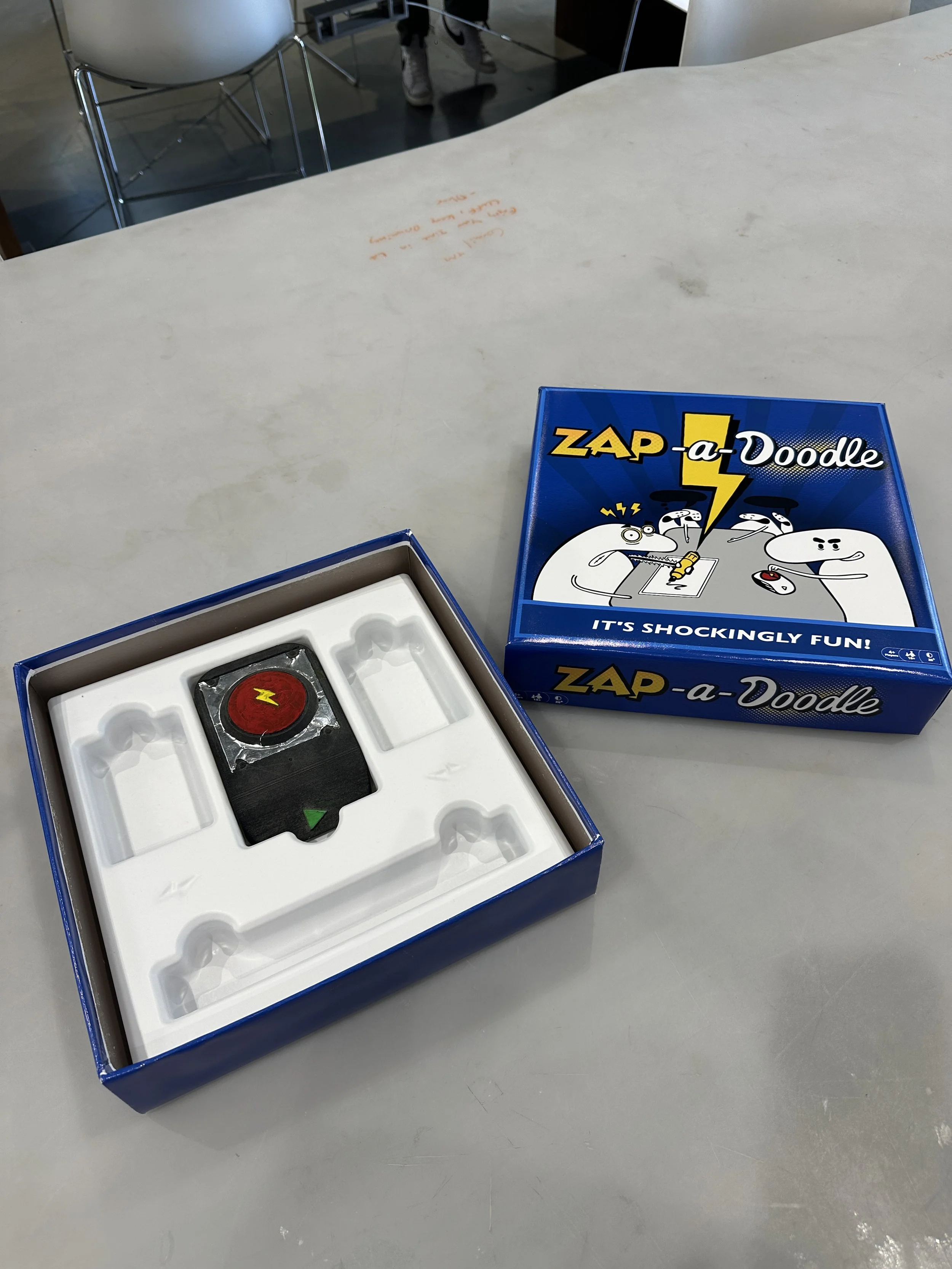
For the final prototype, we committed to building everything in-house rather than outsourcing any of the work. We 3D printed and hand-assembled every component of the pen, refining the structure through repeated iterations. To create the internal plastic casing, we used the CNC machine to carve a wooden mold based on a 3D model of the interior layout. We then heat-wrapped plastic sheets over the mold to form precise, durable shells.
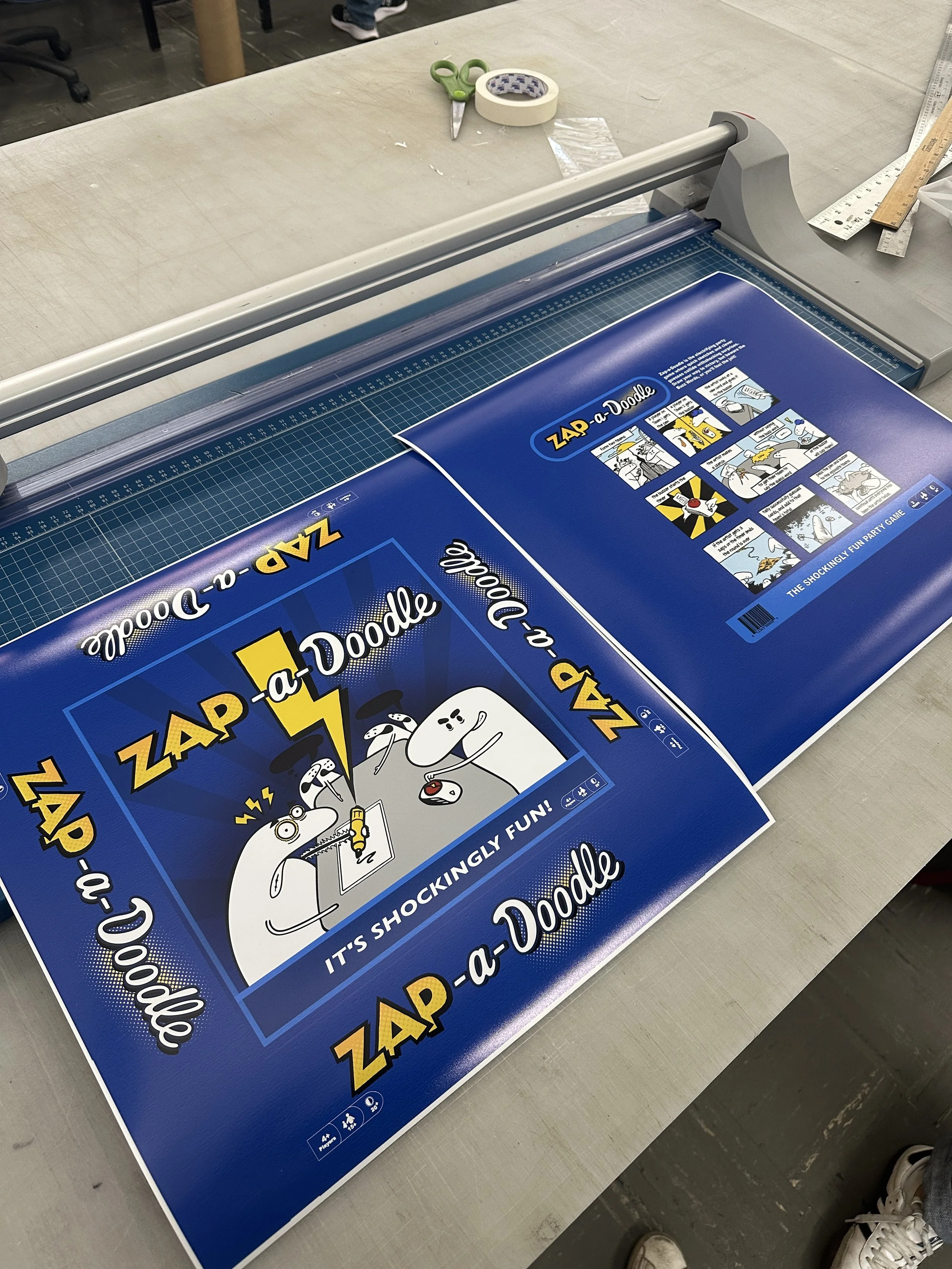
For the outer packaging, we repurposed a high-quality donut box that perfectly matched our desired dimensions. We printed our custom top and bottom designs on glossy paper, carefully adhered them to the box, and transformed it into a polished, shelf-ready package. The only element we produced externally was the set of cards, since we did not have the equipment required to manufacture them in-house.